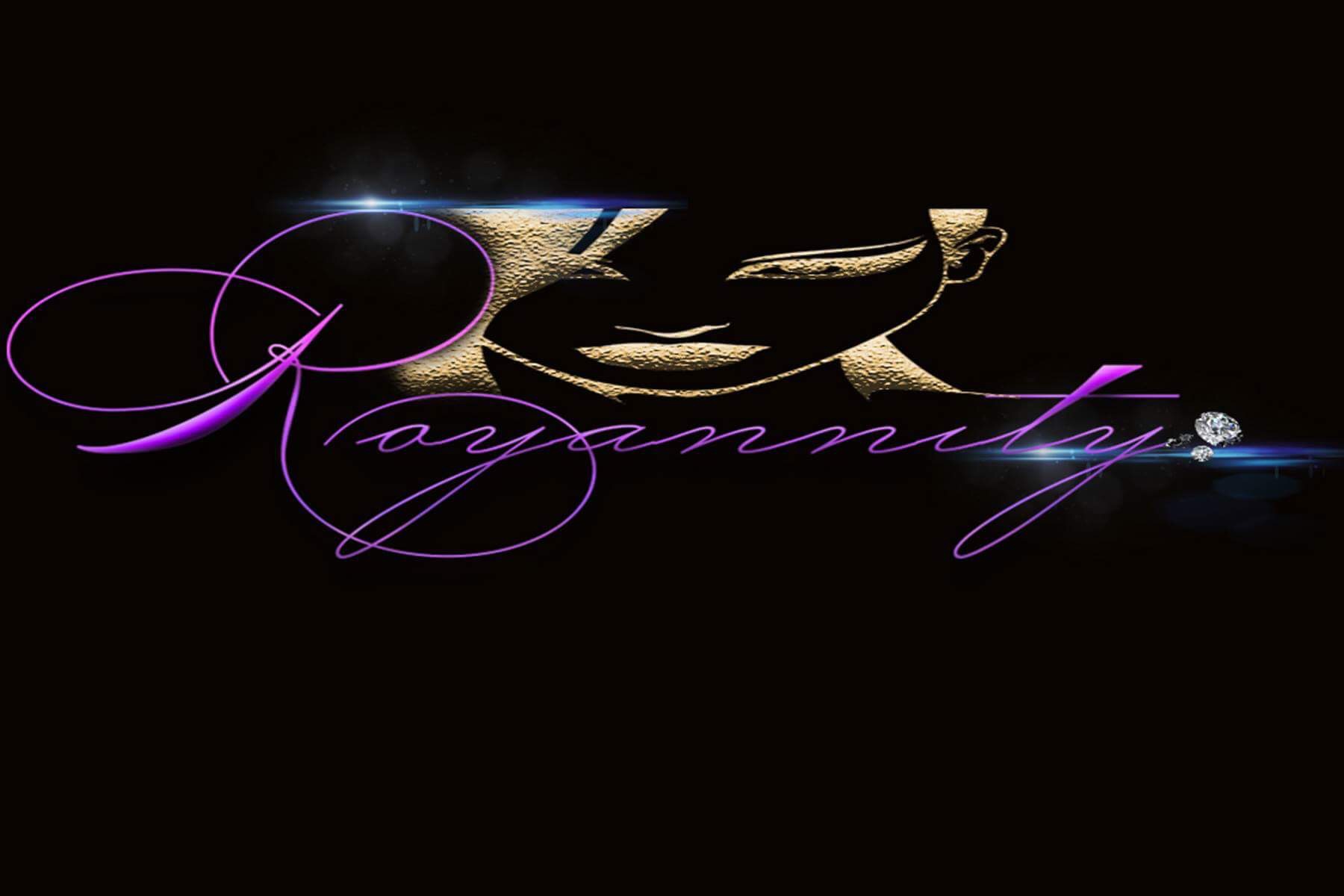
Brand Identity
The Royannity Brand Kit
Our visual identity — colors, typography, logos, and guidelines that define the Royannity aesthetic.
01
Color Palette
Every shade chosen to evoke luxury, power, and beauty.
Onyx Black
Primary Dark / Backgrounds
Amethyst
Brand Purple / Accents
Royal Gold
Gold Accent / CTAs
Deep Plum
Dark Sections
Warm Cream
Light Backgrounds
Soft Lavender
Muted / Cards
02
Typography
Two typefaces — one regal, one refined.
Display / Heading
Playfair Display
Wear Your Crown
Weights
Regular 400
Bold 700
Used for all headlines, display text, and brand statements. Elegant, editorial, and timeless.
Body / UI
Jost
Royannity is more than a beauty brand — it's a movement for women who refuse to dim their light. Every product, every class, every experience is crafted to help you show up as the royalty you already are.
Weights
Light 300
Regular 400
Semibold 600
Used for body copy, navigation, labels, and UI text. Clean, modern, and highly legible.
03
Logo Suite
Use the appropriate logo variation for each context.

Horizontal
Primary use — headers, email, print

Stacked / Vertical
Social profiles, square formats

Icon Mark
Favicon, app icon, small placements
Horizontal — Light BG
Use on cream or white backgrounds
Horizontal — Purple BG
Use on brand purple backgrounds
Horizontal — Gold BG
Use sparingly on gold accent areas
04
Brand Voice
How Royannity speaks.
Regal
We speak with confidence and authority. Never apologetic, never small.
Warm
We celebrate every woman. Our tone is inclusive, uplifting, and sisterly.
Bold
We say what we mean. Direct, vivid language that commands attention.
Luxurious
Every word feels intentional. We choose quality over quantity in our copy.
05
Do's & Don'ts
Do
Use the full logo on dark or light backgrounds with sufficient clear space
Pair Playfair Display headlines with Jost body text
Use Royal Gold sparingly as an accent — it should always feel special
Maintain high contrast between text and backgrounds
Don't
Never stretch, rotate, or distort the logo
Never place the logo on a busy or low-contrast background
Never use off-brand colors or substitute fonts
Never use all-lowercase for the brand name — it's always Royannity